Kuuvik Capture 3.3 : Clipping Warnings

Version 3.3 is an important milestone in Kuuvik Capture‘s history. It replaces the Apple-provided display processing frameworks – which continuously entertained me with serious bugs over the years – with my own code. And as it usually happens when I put my stuff in place of some dependency, it’s significantly faster, more reliable and opens up new possibilities. This post is about one of those new possibilities.

The app had RAW-based clipping warnings from the very beginning. Multi-level warnings that get stronger as more channels are clipped were introduced in version 2.4. And now clipping warnings based on processed (JPEG) data join Kuuvik Capture’s exposure evaluation toolset.

RAW and Processed clipping warning layers

Processed clipping warnings are also multi-level. And they are available during live view and movie recording. Just keep in mind that exposure simulation should be enabled on the camera for the best results (otherwise live view will not reflect your current exposure).

RAW and processed layers can be shown separately or combined. When used together, the processed layer usually triggers first, just like I showed that in my post about the Dual Histogram. To be able to distinguish the two types when used together, you can choose from different color themes for the processed warning layers (RAW layers are always red/blue).

Menu items controlling warning layers.

There are a bunch of items added to the View menu, as well as to the image’s right-click context menu and to the histogram’s context menu. You can toggle each of the four layers separately, or turn the whole stack on and off with the Clipping Warnings command (or by pressing the W key) when the warnings get in the way of evaluating composition. A new toolbar button is also added for the complete layer stack toggle.

Prefer RAW disables processed layers when RAW data is available for an image. My preferred way of working is to turn Prefer RAW on and set processed warnings to the red/blue theme. This way I always have red/blue warnings: processed ones during live view and for JPG files, and RAW ones for RAW files.

The new display engine also allowed me to reduce aliasing in the RAW shadow clipping warning layer – no more eye straining checkerboard patterns.

Kuuvik Capture 3.3 is available now on the Mac App Store. It is a free update for users who purchased the app from there. You can see the complete list of new features and changes in the release notes.

Kuuvik Capture 3.2 : The Dual Histogram

The very first Kuuvik Capture release introduced RAW histograms in an attempt to provide a tool for judging exposure more precisely than what regular histograms are capable of. I even wrote an article on the merits of having a RAW histogram. The conclusion of that article was that despite you have a RAW histogram, white balancing could clip channels in the converted image even if everything was fine with the RAW; so you need to see both the RAW and the processed histograms (preferably in your RAW converter) for the final decision on your exposure.

While my former article revolved around the white balance issue, other image processing parameters, like picture style and color space, also have heavy influence on histogram precision and usability. Making to see both histogram types a fundamental need. Not to mention that launching a RAW converter is not always convenient to do.

So version 3.2 sports a new Dual Histogram tool to show Kuuvik Capture’s RAW histogram along the usual one generated from processed data.

For images, the processed part is based on the JPG preview that every RAW image contains (this is what Kuuvik Capture displays, and this is the source of the histogram shown on the camera’s LCD). This represents how the image was processed by the camera. Your RAW converter will almost certainly convert it in a different way, so the final word on exposure still belongs to the converter. But the camera’s interpretation gives a solid starting point.

The processed histogram also indicates the image’s color space. Different color spaces have different clipping points – more on this later.

You can clearly see on the example how white balancing influenced things. You’d be in trouble having made a decision solely based on the RAW histogram in this case – the blue channel would be almost completely clipped. The example belongs to the original of the following photo (that is, before contrast stretching and other adjustments).

Ice Abstract

For live view and movie recording the camera always serves video frames in sRGB – even if you set your camera to Adobe RGB. But why is that important? Well, it’s time to talk about the effect of color space choice on histograms.

Color spaces vs. histograms

I made two photos of a regular ColorChecker chart. One with setting the camera to sRGB and another with setting it to Adobe RGB. Lighting and exposure were the same.

As you can see, there’s absolutely no clipping in the RAW data. And there’s no clipping when converted to Adobe RGB. But in sRGB both highlights and shadows are clipped! So live view (which is always in sRGB) may show some clipping while Adobe RGB not. And even a histogram from an Adobe RGB conversion might show clipping while there’s absolutely no clipping in the image when converted to ProPhoto RGB in Capture One.

I’d recommend to treat these processed histogram clipping warnings as different levels. The sRGB warning in live view goes off first, this should ring a bell in your head to watch more closely after taking the image, as there may be a problem. After taking a picture, if Adobe RGB shows clipping, then it’s time to either check it in your RAW converter or back off a little bit.

But RAW histogram clipping warnings are always hard facts: indicating unrecoverable data loss.

The above example explains why I recommend to set your camera to Adobe RGB: to prevent premature clipping in histograms displayed on the camera’s LCD.

A few words on JPG support

JPG files slowly become a first-class citizen in Kuuvik Capture. The JPG processing engine in version 3.2 is up to 5x faster than previous releases. This speedup is what allows efficient histogram generation and made Dual Histograms possible. JPG histogram display was also a requirement for a JPG-only workflow, which was high on our feature request list. And now it’s fully supported as you’ll see in my upcoming post.

Kuuvik Capture 3.2 is available on the Mac App Store. It is a free update for existing Kuuvik Capture 2.x and 3.x users.

Mark II Artist’s Viewfinder 5.0 Available

Version 5.0 of my Mark II Artist’s Viewfinder app is now available on the App Store. It took quite a bit longer than I first planned, but if you look at the sheer number of new stuff, you’ll understand why. More work went into this update than it took to develop the original version 1.

I wrote about the black & white mode and exposure compensation, and the question of RAW capture in former posts, now it’s time to reveal everything else. I’ll touch a few new things in this post, and highly recommend to take a look on the complete list in the release notes. And pay attention to the “Changes” section.

Quick Control Screen

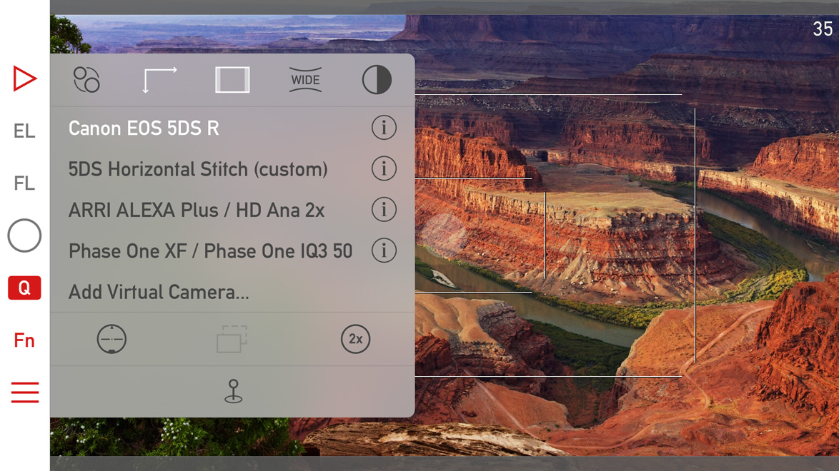
The are a few subtle visual changes to make it less cluttered, and to make room for two new icons. The half dark/half light icon in the upper right toggles black & white mode. The 2x icon switches to the telephoto camera if you have an iPhone 7 Plus. The telephoto camera and wide converter use are mutually exclusive (as one would logically expect).

Icons for parallax correction/shift simulation and aspect ratio changing are now white when a non-default value is set for these (in the above example I set the 5DS R virtual camera to 16:9 aspect ratio).

Album -> Catalog

We had to rename the Album to Catalog to avoid a name clash with the thing that Apple calls an album in the Photos app. Now ours is named Catalog, since it would be extraordinarily hard to convince Apple that they should change…

And while we are talking about the Catalog, there are performance improvements here and there, meaning that an update may be required to the new format. The app automatically detects if this is the case, and will update the Catalog automatically.

Availability

This is a free update for existing Mark II Artist’s Viewfinder owners. New user can purchase the app from the App Store.

We offer upgrade bundles for former Viewfinder Basic/Pro/Cine edition owners, so they can upgrade for a reduced price.

The Viewfinder Handbook was also updated to cover all the new features.

Why iPhone RAW is a Big Deal

iOS 10 brought the capability to get the RAW image data from the camera and save it as a DNG file. It elevates the quality of iPhone images to a whole new level (for those who care). The following image tells it all.

Click the image for actual pixels display on non-Retina screens

Click the image for actual pixels display on non-Retina screens

On the left is how the iPhone renders the image, on the right my version converted from DNG and tweaked to taste in Capture One. Both show the actual pixels (100% magnification). Red areas are the overexposed parts. The images were captured as RAW+JPG in the upcoming Mark II Artist’s Viewfinder 5.0, so they represent the exact same moment.

With shooting RAWs you can avoid most of the pitfalls of iPhone image processing (I know them from experience):

  • Over-sharpening, which ruins images with already high contrast edges, such as tree branches against the clear sky.
  • Excessive noise reduction – usually on an unnecessary level, even at ISO 25. You know, the blotchy look at 100% which looks downright ugly.
  • Unrealistic color. Apple processes the images for punch, which is good for making your friends envious on social networking sites, but is a problem when you want to actually use them (the images, not your friends) as real photographs.
  • Sometimes overdone light falloff correction. You know, when the sky is brighter in the corners than in the center.

You also get more headroom for recovering overexposed areas (they are also better by default because of the lower contrast), but on the other hand you need to correct corner light falloff by hand.

To my eye the difference is so large that I won’t use JPGs any more when I’m photographing with the iPhone (which happens a lot, since it’s always in my pocket). No, they are not challenging DSLR (or even large sensor point and shoot) quality, but are way more usable than the JPGs.